基础笔记
常见的浏览器内核
pTrident (三叉戟):IE、360安全浏览器、搜狗高速浏览器、百度浏览器、UC浏览器; pGecko(壁虎):Mozilla Firefox; pPresto(急板乐曲)->Blink (眨眼):Opera pWebkit :Safari、360极速浏览器、搜狗高速浏览器、移动端浏览器(Android、iOS) pWebkit ->Blink :Google Chrome
常见的字符实体

URL和URI的区别
URI = Uniform Resource Identifier 统一资源标志符,用于标识 Web 技术使用的逻辑或物理资源。;
URL = Uniform Resource Locator 统一资源定位符,俗称网络地址,相当于网络中的门牌号;
URI在某一个规则下能把一个资源独一无二的识别出来。
URL作为一个网络Web资源的地址,可以唯一将一个资源识别出来,所以URL是一个URI;
所以URL是URI的一个子集;但是URI并不一定是URL
必须掌握的CSS属性

CSS文档地址
CSS属性的官方文档 https://www.w3.org/TR/?tag=css CSS推荐文档地址:https://developer.mozilla.org/zh-CN/docs/Web/CSS/Reference#%E5%85%B3%E9%94%AE%E5%AD%97%E7%B4%A2%E5%BC%95 由于浏览器版本、CSS版本等问题,查询某些CSS是否可用:可以到https://caniuse.com/查询CSS属性的可用性;
CSS选择器
- 通用选择器(universal selector)
- 元素选择器(type selectors)
- 类选择器(class selectors)
- id选择器(id selectors)
- 属性选择器(attribute selectors)
- 组合(combinators)
- 伪类(pseudo-classes)
- 伪元素(pseudo-elements)
伪类
伪类(pseudo-class)则是用来描述一些处于特定状态的元素,比如被鼠标悬停、被点击、被选中等。常见的伪类包括:
1.动态伪类(dynamic pseudo-classes)
- :link、:visited、:hover、:active、:focus
2.目标伪类(target pseudo-classes)
- :target
3.语言伪类(language pseudo-classes)
- :lang( )
4.元素状态伪类(UI element states pseudo-classes)
- :enabled、:disabled、:checked
5.结构伪类(structural pseudo-classes)(后续学习)
- :nth-child( )、:nth-last-child( )、:nth-of-type( )、:nth-last-of-type( )
- :first-child、:last-child、:first-of-type、:last-of-type
- :root、:only-child、:only-of-type、:empty
6.否定伪类(negation pseudo-classes)(后续学习)
- :not()
所有的伪类: https://developer.mozilla.org/zh-CN/docs/Web/CSS/Pseudo-classes
伪元素
伪元素(pseudo-element)用于向某些选择器添加一些特殊的效果,比如在已有内容之前或之后插入额外的内容。常见的伪元素包括:
::before:在目标元素内部最前面插入内容。::after:在目标元素内部最后面插入内容。::first-letter:选择第一个字母。::first-line:选择第一行文本。
伪元素与伪类的区别
- 伪元素用于创建一些不存在于文档树中的元素,并对其进行样式设置;伪类则是对文档树中已有的元素进行样式设置。
- 伪元素使用双冒号
::,而伪类使用单冒号:。 - 在一个选择器中,伪元素必须位于最后面。例如,
.myclass::before是正确的写法,而.myclass:before::after则是错误的写法。而对于伪类,则没有这样的限制。
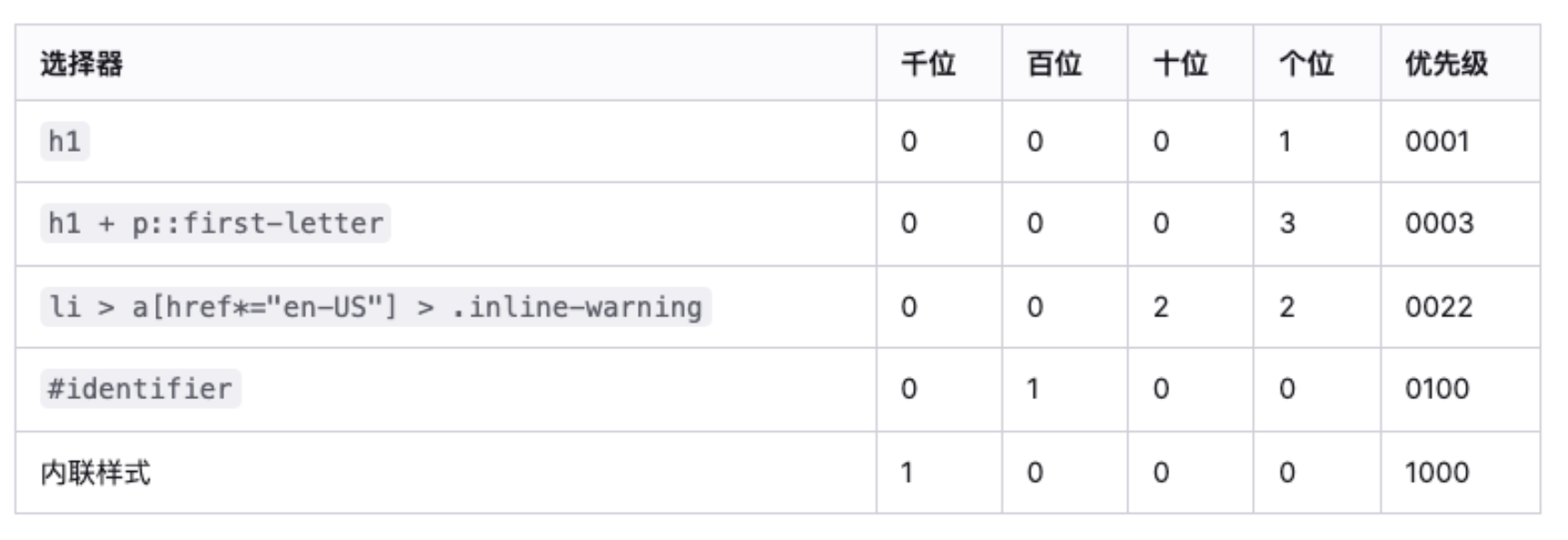
选择器的权重
!important:10000
内联样式:1000
id选择器:100
类选择器、属性选择器、伪类:10
元素选择器、伪元素:1
通配符:0
display值的特性
block元素:
- 独占父元素的一行 可以随意设置宽高 高度默认由内容决定
inline-block元素:
跟其他行内级元素在同一行显示
可以随意设置宽高
可以这样理解,对外来说,它是一个行内级元素 对内来说,它是一个块级元素
inline:
- 跟其他行内级元素在同一行显示;
- 不可以随意设置宽高;
- 宽高都由内容决定;
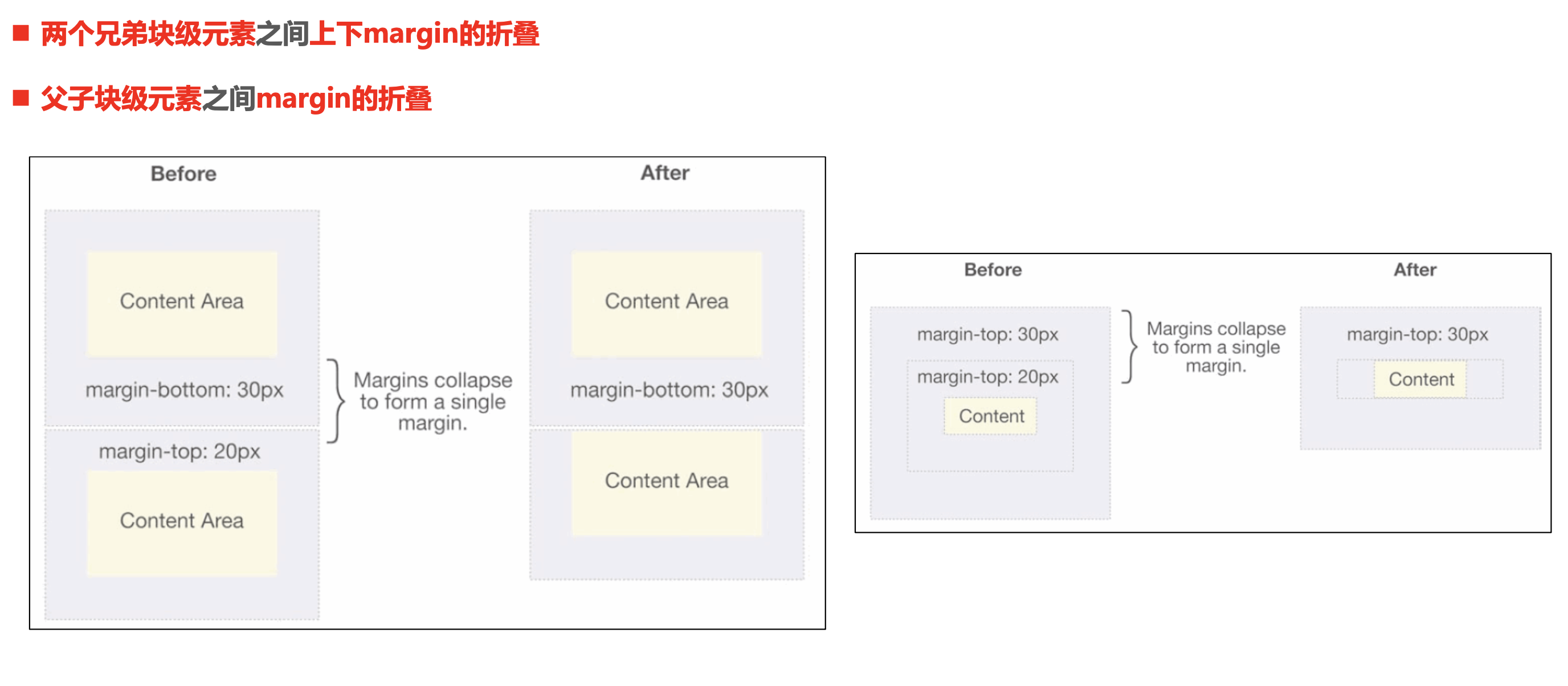
上下margin的传递
margin-top传递
- 如果块级元素的顶部线和父元素的顶部线重叠,那么这个块级元素的margin-top值会传递给父元素
margin-bottom传递
- 如果块级元素的底部线和父元素的底部线重写,并且父元素的高度是auto,那么这个块级元素的margin-bottom值会传递给父元素
如何防止出现传递问题?
- 给父元素设置padding-top\padding-bottom
- 给父元素设置border
- 触发BFC: 设置overflow为auto
建议:
- margin一般是用来设置兄弟元素之间的间距
- padding一般是用来设置父子元素之间的间距
上下 margin 的折叠
垂直方向上相邻的2个margin(margin-top、margin-bottom)有可能会合并为1个margin,这种现象叫做collapse(折叠)
- 折叠后最终值的计算规则两个值进行比较,取较大的值
水平方向上的margin(margin-left、margin-right)永远不会collapse
如何防止margin collapse?
- 只设置其中一个元素的margin
行内非替换元素的注意事项
以下属性对行内级非替换元素不起作用
width、height、margin-top、margin-bottom
以下属性对行内级非替换元素的效果比较特殊
padding-top、padding-bottom:上下会被撑起来,但是不会占用空间
border-top、border-bottom:上下会被撑起来,但是不会占用空间
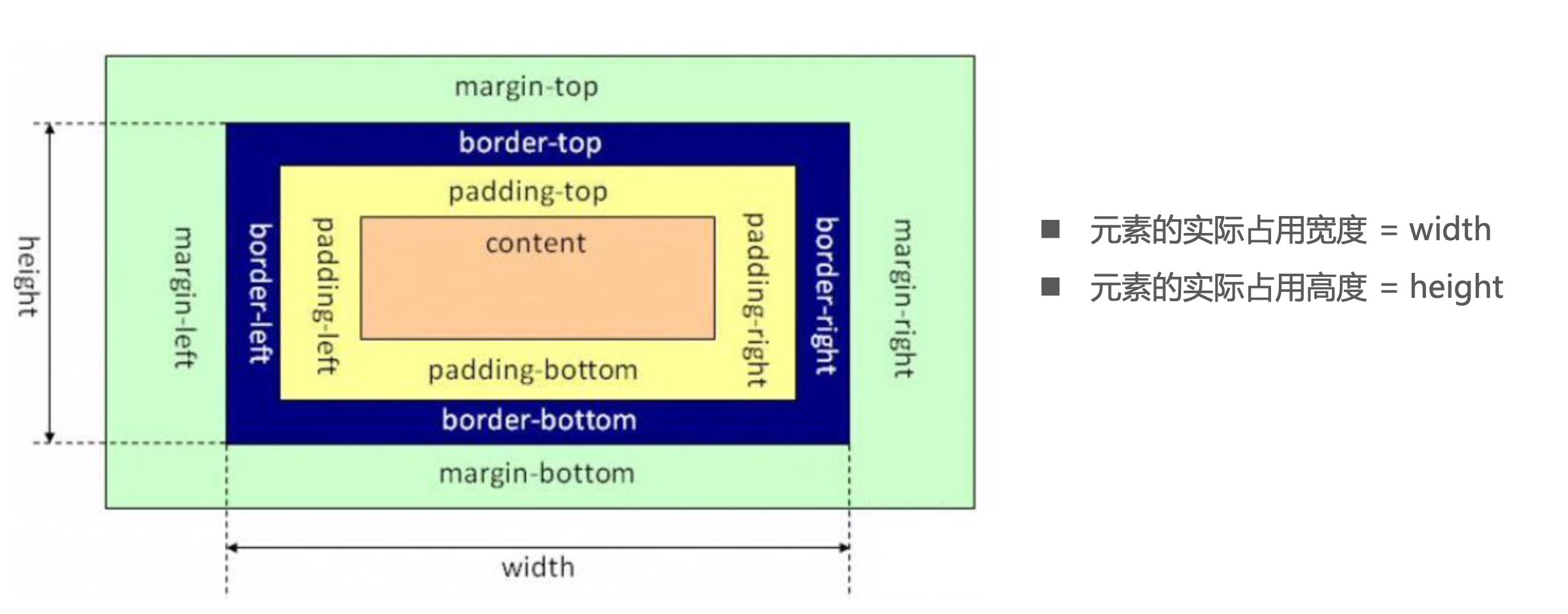
box-sizing
- content-box
- padding、border都布置在width、height外边
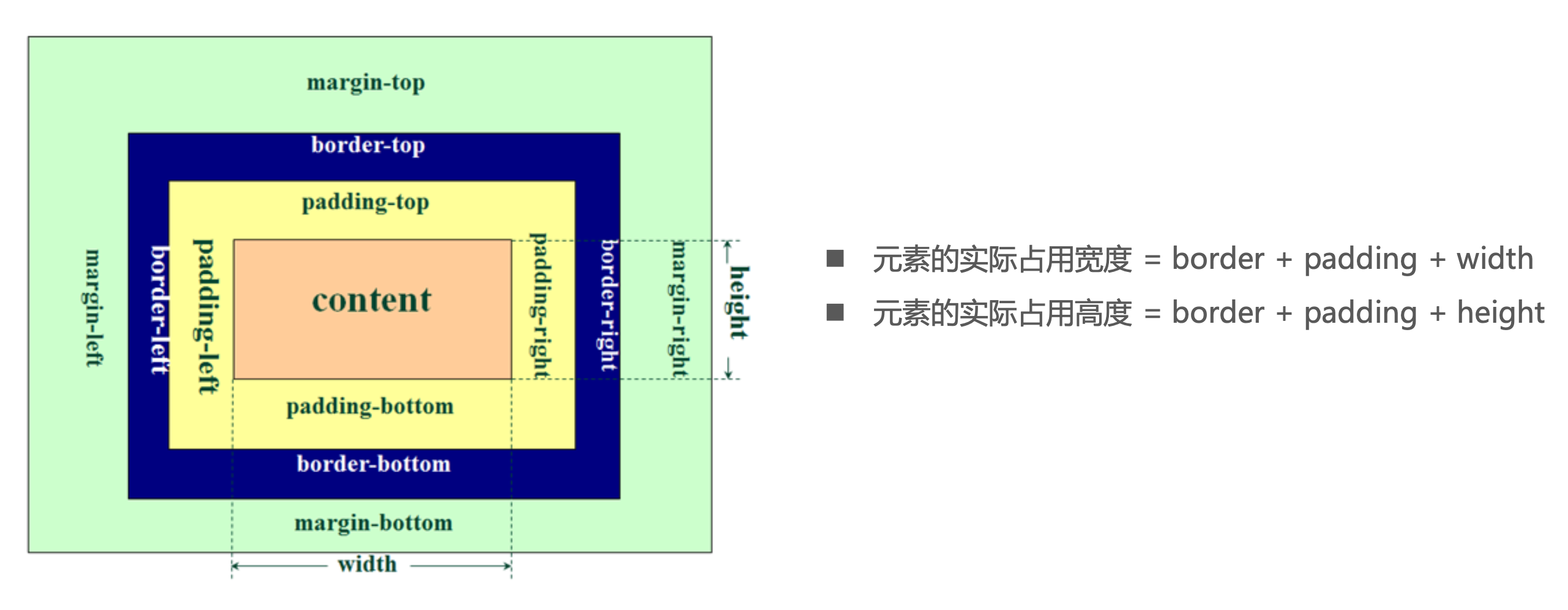
- border-box
- padding、border都布置在width、height里边
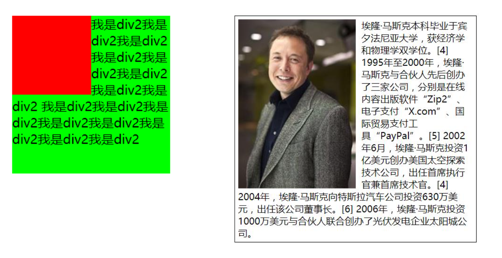
background-image和img对比
利用background-image和img都能够实现显示图片的需求,在开发中该如何选择?
总结
- img,作为网页内容的重要组成部分,比如广告图片、LOGO图片、文章配图、产品图片
- background-image,可有可无。有,能让网页更加美观。无,也不影响用户获取完整的网页内容信息
CSS定位
相对定位 - relative
- 元素按照normal flow布局
- 可以通过left、right、top、bottom进行定位
- 定位参照对象是元素自己原来的位置
- 相对定位的应用场景,在不影响其他元素位置的前提下,对当前元素位置进行微调
固定定位 - fixed
- 元素脱离normal flow(脱离标准流、脱标)
- 可以通过left、right、top、bottom进行定位
- 定位参照对象是视口(viewport)
- 当画布滚动时,固定不动
绝对定位 - absolute
- 元素脱离normal flow(脱离标准流、脱标)
- 可以通过left、right、top、bottom进行定位
- 定位参照对象是最邻近的定位祖先元素,如果找不到这样的祖先元素,参照对象是视口
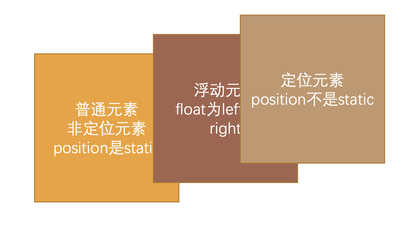
- 定位元素(positioned element),position值不为static的元素,也就是position值为relative、absolute、fixed的元素
定位元素的特点
可以随意设置宽高
宽高默认由内容决定
不再受标准流的约束
不再严格按照从上到下、从左到右排布,不再严格区分块级、行内级,块级、行内级的很多特性都会消失
不再给父元素汇报宽高数据
脱标元素内部默认还是按照标准流布局
定位元素的公式
如果一个元素的属性值设置为auto,意思是就让浏览器自己自动计算,而不是100%的意思。
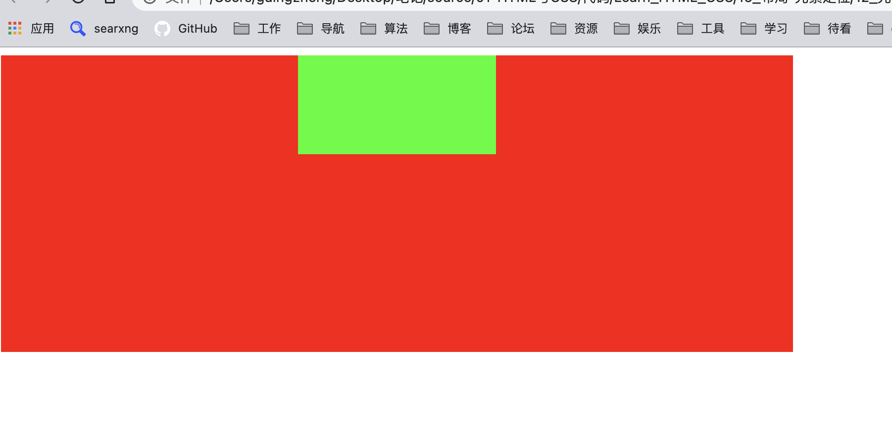
对于绝对定位元素来说,定位参照对象的宽度 = left + right + margin-left + margin-right + 绝对定位元素的实际占用宽度
假设父元素为800px,子元素宽度不设置(为auto),left为0,right为0,margin-left为0,margin-right:0,
则可得800=auto+0+0+0+0,则子元素宽度就是充满父元素宽度,auto就是800。
 <style>
    .box {
      width: 800px;
      height: 300px;
      background-color: #f00;
      position: relative;
    }

    /* 兼容性 */
    .container {
      height: 100px;
      background-color: #0f0;


      position: absolute;
      left: 0;
      right: 0;
      margin: 0;
    }
  </style>
</head>
<body>

  <div class="box">
    <div class="container"></div>
  </div>

</body>

- 假设父元素为800px,子元素宽度为200,left为0,right为0,margin-left为auto,margin-right:auto,
- 则可得800=200+0+0+auto+auto,则子元素的左右外边距auto被自动平均分配为300,从而实现居中。
 <style>
    .box {
      width: 800px;
      height: 300px;
      background-color: #f00;
      position: relative;
    }

    /* 兼容性 */
    .container {
      height: 100px;
      background-color: #0f0;

      width:200px;
      position: absolute;
      left: 0;
      right: 0;
      margin: 0 auto;
    }
  </style>
</head>
<body>

  <div class="box">
    <div class="container"></div>
  </div>

</body>
- 高度也是同样的公式,定位参照对象的高度 = top + bottom + margin-top + margin-bottom + 绝对定位元素的实际占用高度
- 如果希望绝对定位元素的宽高和定位参照对象一样,可以给绝对定位元素设置以下属性 left: 0、right: 0、top: 0、bottom: 0、margin:0
<style>
    .box {
      width: 800px;
      height: 300px;
      background-color: #f00;
      position: relative;
    }

    /* 兼容性 */
    .container {
      background-color: #0f0;

      position: absolute;
      left: 0;
      right: 0;
      top: 0;
      bottom: 0;
      margin: 0 ;
    }
  </style>
</head>
<body>

  <div class="box">
    <div class="container"></div>
  </div>

</body>

- 如果希望绝对定位元素垂直居中,可以给绝对定位元素设置以下属性width:100、height:100、 left: 0、right: 0、top: 0、bottom: 0、margin:auto
 <style>
    .box {
      width: 800px;
      height: 300px;
      background-color: #f00;
      position: relative;
    }

    /* 兼容性 */
    .container {

      background-color: #0f0;

      height: 100px;
      width: 100px;
      position: absolute;
      left: 0;
      right: 0;
      top: 0;
      bottom: 0;
      margin: auto ;
    }
  </style>
</head>
<body>

  <div class="box">
    <div class="container"></div>
  </div>

</body>
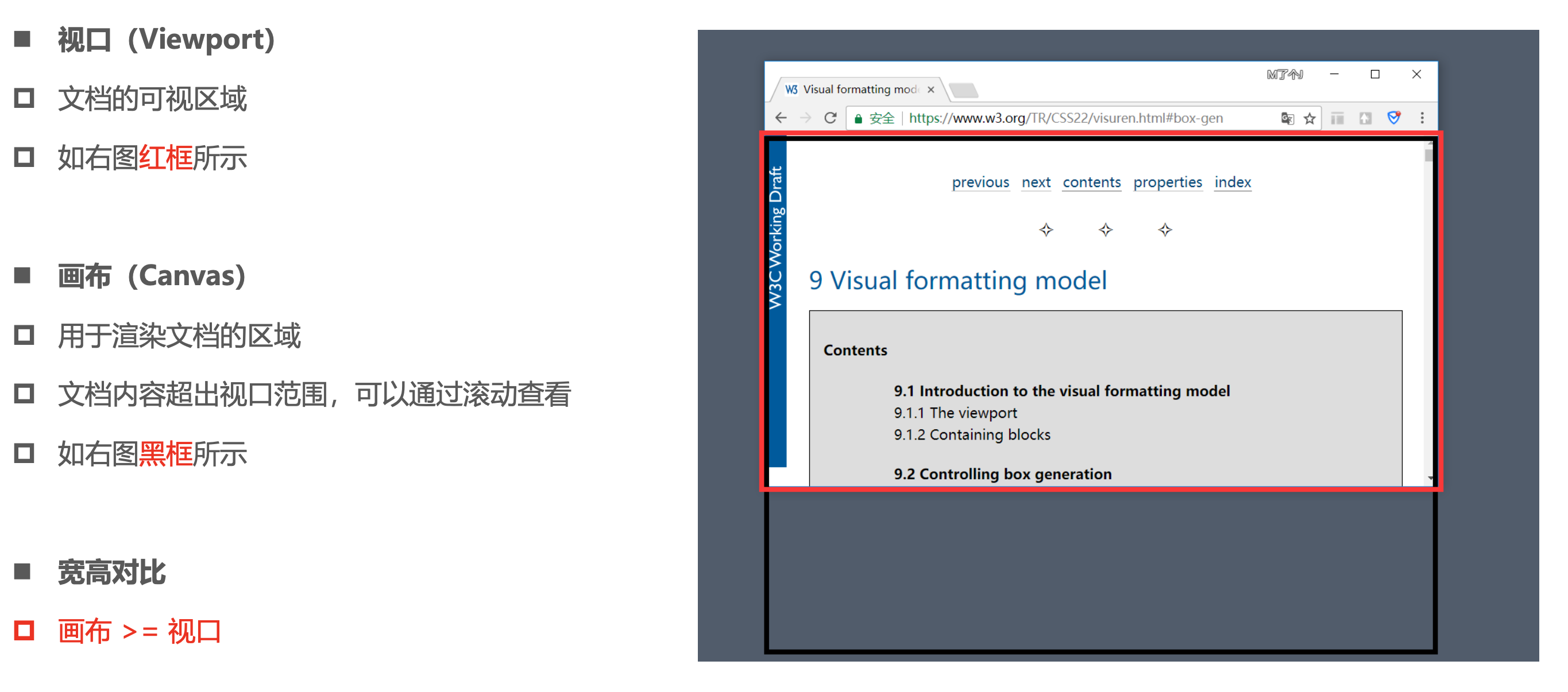
画布 和 视口
粘性定位 - sticky
另外还有一个定位的值是position: sticky,比起其他定位值要新一些.
- sticky是一个大家期待已久的属性;
- 可以看做是相对定位和固定定位的结合体;
- 它允许被定位的元素表现得像相对定位一样,直到它滚动到某个阈值点; 当达到这个阈值点时, 就会变成固定定位;
- sticky是基于祖先滚动容器的,如果没有滚动容器,则基于视口的
浮动Float
- float 属性可以指定一个元素应沿其容器的左侧或右侧放置,允许文本和内联元素环绕它。
- float 属性最初只用于在一段文本内浮动图像, 实现文字环绕的效果;
- 但是早期的CSS标准中并没有提供好的左右布局方案, 因此在一段时间里面它成为网页多列布局的最常用工具;
- 绝对定位、浮动都会让元素脱离标准流,以达到灵活布局的效果
- 可以通过float属性让元素产生浮动效果,float的常用取值
- none:不浮动,默认值
- left:向左浮动
- right:向右浮动
浮动规则
元素一旦浮动后, 脱离标准流朝着向左或向右方向移动,直到自己的边界紧贴着包含块(一般是父元素)或者其他浮动元素的边界为止
定位元素会层叠在浮动元素上面
如果元素是向左(右)浮动,浮动元素的左(右)边界不能超出包含块的左(右)边界
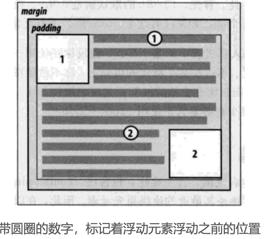
浮动元素之间不能层叠
如果一个元素浮动,另一个浮动元素已经在那个位置了,后浮动的元素将紧贴着前一个浮动元素(左浮找左浮,右浮找右浮)
如果水平方向剩余的空间不够显示浮动元素,浮动元素将向下移动,直到有充足的空间为止
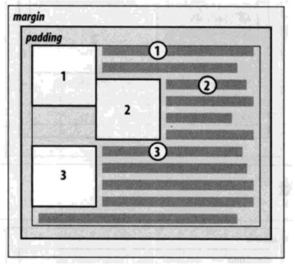
浮动元素不能与行内级内容层叠,行内级内容将会被浮动元素推出
比如行内级元素、inline-block元素、块级元素的文字内容
- 行内级元素、inline-block元素浮动后,其顶部将与所在行的顶部对齐
浮动的问题 – 高度塌陷
由于浮动元素脱离了标准流,变成了脱标元素,所以不再向父元素汇报高度
父元素计算总高度时,就不会计算浮动子元素的高度,导致了高度坍塌的问题
解决父元素高度坍塌问题的过程,一般叫做清浮动(清理浮动、清除浮动)
清浮动的目的是让父元素计算总高度的时候,把浮动子元素的高度算进去
clear 属性可以指定一个元素是否必须移动(清除浮动后)到在它之前的浮动元素下面;
clear的常用取值
- left:要求元素的顶部低于之前生成的所有左浮动元素的底部
- right:要求元素的顶部低于之前生成的所有右浮动元素的底部
- both:要求元素的顶部低于之前生成的所有浮动元素的底部
- none:默认值,无特殊要求
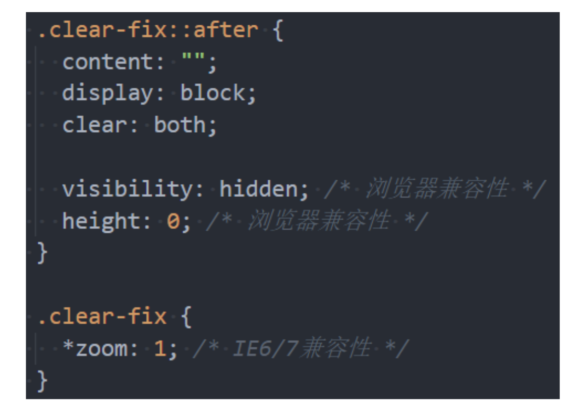
给父元素增加::after伪元素,纯CSS样式解决,结构与样式分离(推荐)
Flex布局
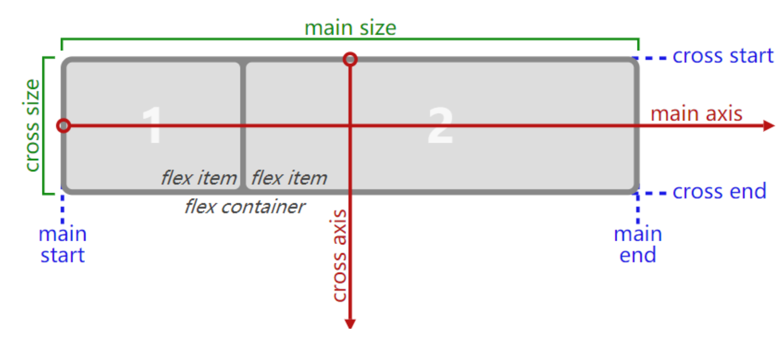
flex布局的重要概念
两个重要的概念:
开启了 flex 布局的元素叫 flex container
flex container 里面的直接子元素叫做 flex item
当flex container中的子元素变成了flex item时, 具备一下特点:
flex item的布局将受flex container属性的设置来进行控制和布局;
flex item不再严格区分块级元素和行内级元素;
flex item默认情况下是包裹内容的, 但是可以设置宽度和高度;
flex布局的模型
flex相关的属性
应用在 flex container 上的 CSS 属性
- flex-direction
- flex-wrap
- flex-flow
- justify-content
- align-items
- align-content
应用在 flex items 上的 CSS 属性
- flex-basis
- flex-grow
- flex-shrink
- order
- align-self
- flex
flex-direction
- flex items 默认都是沿着 main axis(主轴)从 main start 开始往 main end 方向排布
- flex-direction 决定了 main axis 的方向,有 4 个取值
- row(默认值)
- row-reverse
- column
- column-reverse

flex-wrap
- flex-wrap 决定了 flex container 是单行还是多行
- nowrap(默认):单行
- wrap:多行
- wrap-reverse:多行(对比 wrap,cross start 与 cross end 相反)
flex-flow
flex-flow 属性是 flex-direction 和 flex-wrap 的简写。顺序任何, 并且都可以省略;

justify-content
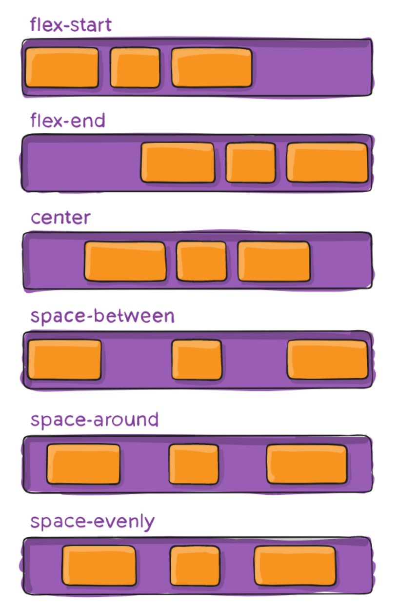
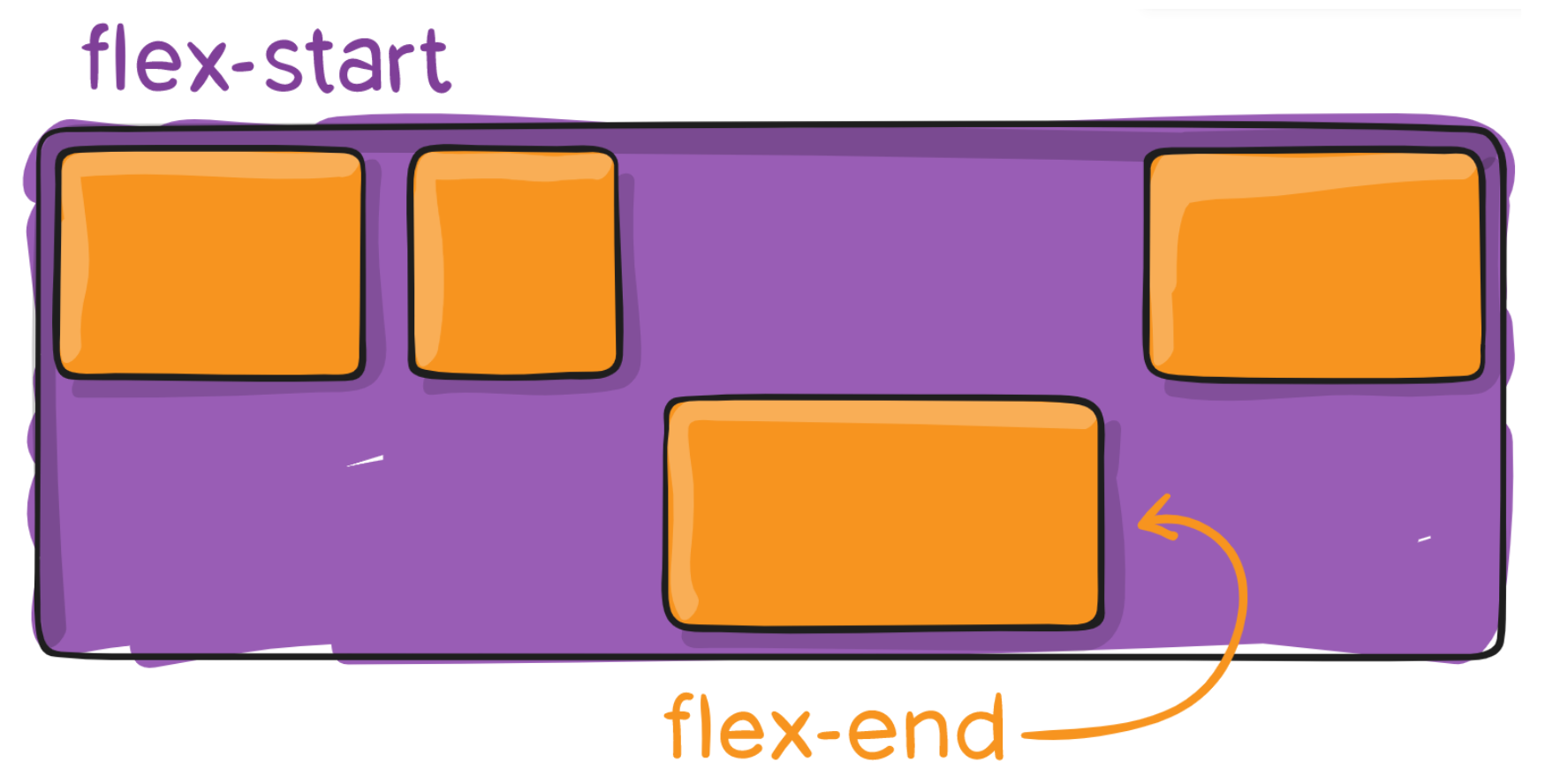
justify-content 决定了 flex items 在 main axis 上的对齐方式
flex-start(默认值):与 main start 对齐
flex-end:与 main end 对齐
center:居中对齐
space-between:
flex items 之间的距离相等
与main start、main end两端对齐
space-evenly:
flex items 之间的距离相等
flex items 与 main start、main end 之间的距离 等于 flex items 之间的距离
space-around:
flex items 之间的距离相等
flex items 与 main start、main end 之间的距离是 flex items 之间距离的一半
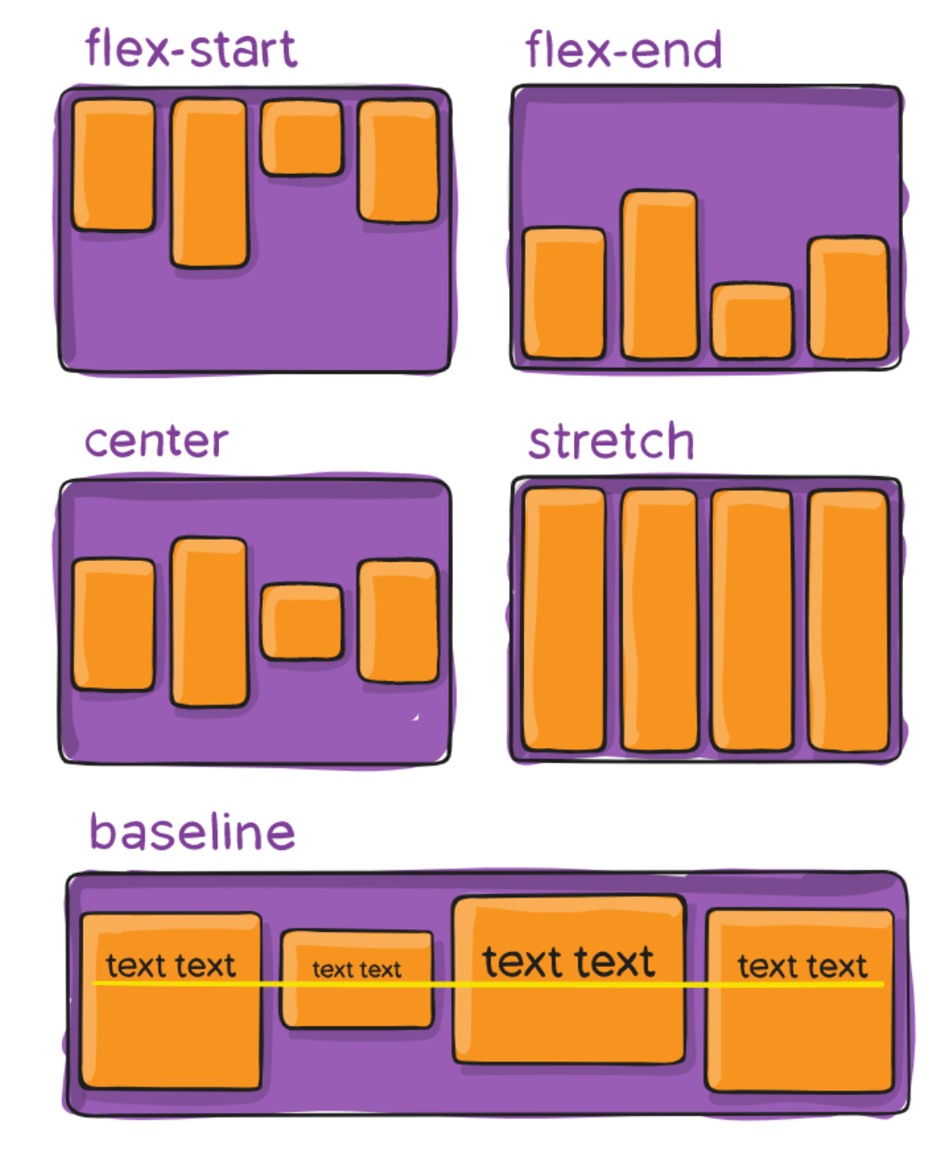
align-items
align-items 决定了 flex items 在 cross axis 上的对齐方式
- normal:在弹性布局中,效果和stretch一样
- stretch:当 flex items 在 cross axis 方向的 size 为 auto 时,会自动拉伸至填充 flex container
- flex-start:与 cross start 对齐
- flex-end:与 cross end 对齐
- center:居中对齐
- baseline:与基准线对齐
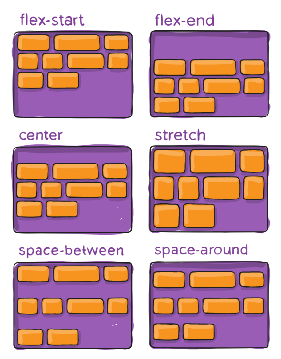
align-content
align-content 决定了多行 flex items 在 cross axis 上的对齐方式,用法与 justify-content 类似
- stretch(默认值):与 align-items 的 stretch 类似
- flex-start:与 cross start 对齐
- flex-end:与 cross end 对齐
- center:居中对齐
- space-between:flex items 之间的距离相等与 cross start、cross end两端对齐
- space-evenly:flex items 之间的距离相等flex items 与 cross start、cross end 之间的距离 等于 flex items 之间的距离
- space-around:flex items 之间的距离相等flex items 与 cross start、cross end 之间的距离是 flex items 之间距离的一半
flex-item属性 - order
- order 决定了 flex items 的排布顺序
- 可以设置任意整数(正整数、负整数、0),值越小就越排在前面默认值是 0
flex-item属性 - align-self
- flex items 可以通过 align-self 覆盖 flex container 设置的 align-items:
- 遵从 flex container 的 align-items 设置stretch、flex-start、flex-end、center、baseline,效果跟 align-items 一致
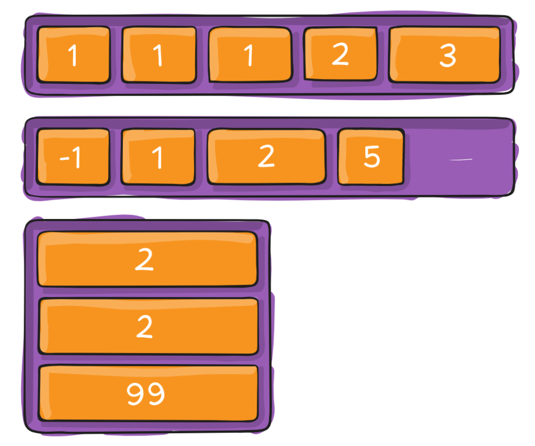
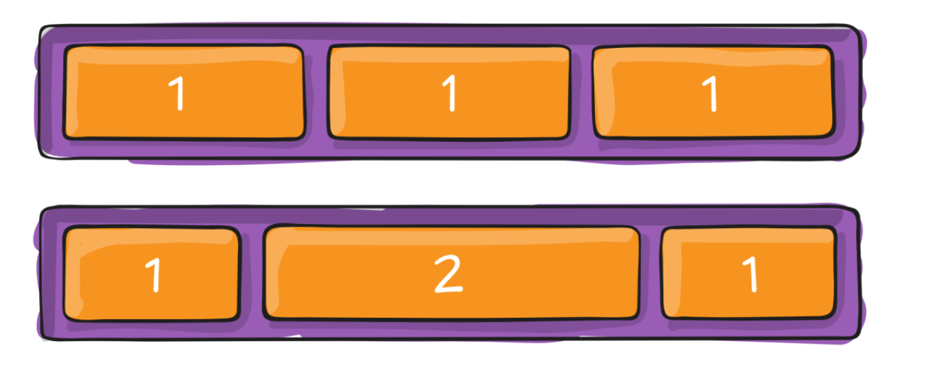
flex-item属性 - flex-grow
- flex-grow 决定了 flex items 如何扩展(拉伸/成长)
- 可以设置任意非负数字(正小数、正整数、0),默认值是 0
- 当 flex container 在 main axis 方向上有剩余 size 时,flex-grow 属性才会有效
- 如果所有 flex items 的 flex-grow 总和 sum 超过 1,
- 每个 flex item 扩展的 size 为flex container 的剩余 size * flex-grow / sum
- flex items 扩展后的最终 size 不能超过 max-width\max-height
flex-item属性 - flex-shrink
- flex-shrink 决定了 flex items 如何收缩(缩小)
- 可以设置任意非负数字(正小数、正整数、0),默认值是 1
- 当 flex items 在 main axis 方向上超过了 flex container 的 size,flex-shrink 属性才会有效
- 如果所有 flex items 的 flex-shrink 总和超过 1,
- 每个 flex item 收缩的 size为flex items 超出 flex container 的 size * 收缩比例 / 所有 flex items 的收缩比例之和
- flex items 收缩后的最终 size 不能小于 min-width\min-height
flex-item属性 - flex-basis
- flex-basis 用来设置 flex items 在 main axis 方向上的 base size
- auto(默认值)、具体的宽度数值(100px)
- 决定 flex items 最终 base size 的因素,从优先级高到低
- max-width\max-height\min-width\min-height
- flex-basis
- width\height
- 内容本身的 size
flex-item属性 - flex属性
flex 是 flex-grow || flex-shrink || flex-basis 的简写,flex 属性可以指定1个,2个或3个值。
单值语法: 值必须为以下其中之一:
一个无单位数(
<number>): 它会被当作<flex-grow>的值。一个有效的宽度(width)值: 它会被当作
<flex-basis>的值。关键字none,auto或initial.
双值语法: 第一个值必须为一个无单位数,并且它会被当作
<flex-grow>的值。第二个值必须为以下之一:
一个无单位数:它会被当作
<flex-shrink>的值。一个有效的宽度值: 它会被当作
<flex-basis>的值。三值语法:
第一个值必须为一个无单位数,并且它会被当作
<flex-grow>的值。第二个值必须为一个无单位数,并且它会被当作
<flex-shrink>的值。第三个值必须为一个有效的宽度值, 并且它会被当作
<flex-basis>的值。
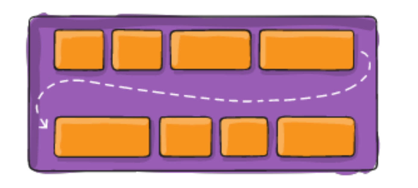
flex多行对齐的问题
思考: 如下布局如何解决对其问题

- 解决方法之一,不使用space-between,改用手动使用margin-right。
- 解决方式之二,使用多余的元素,并将这些元素高度设置为0,用来填充缺少的空间。
- 添加元素的个数是:列数-2
 <style>
    .container {
      width: 500px;
      background-color: orange;

      display: flex;
      flex-wrap: wrap;
      justify-content: space-between;
    }
    .item {
      width: 110px;
      height: 140px;
    }

    .container > i {
      width: 110px;
    }

  </style>

<body>

  <div class="container">
    <div class="item item1">1</div>
    <div class="item item2">2</div>
    <div class="item item3">3</div>
    <div class="item item4">4</div>

    <div class="item item1">1</div>
    <div class="item item2">2</div>

    <!-- 添加span的个数是列数减-2 -->
   <i></i><i></i>
  </div>

</body>
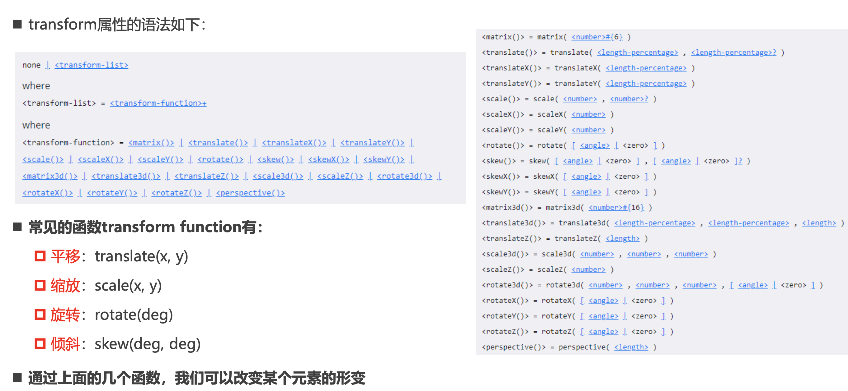
CSS属性 - transform
- CSS transform属性允许对某一个元素进行某些形变, 包括旋转,缩放,倾斜或平移等。
- 注意事项,并非所有的盒子都可以进行transform的转换(通常行内级元素不能进行形变)
- 所以,transform对于行内级非替换元素是无效的; 比如对span、a元素等;
transition动画
transition CSS 属性是 transition-property,transition-duration,transition-timing-function 和 transition-delay 的一个简 写属性。
transition-property:指定应用过渡属性的名称
- all:所有属性都执行动画;
- none:所有属性都不执行动画;
- CSS属性名称:要执行动画的CSS属性名称,比如width、left、transform等;
transition-duration:指定过渡动画所需的时间 单位可以是秒(s)或毫秒(ms)
transition-timing-function:指定动画的变化曲线
transition-delay:指定过渡动画执行之前的等待时间
并非所有的CSS属性都可以执行动画的,那么我们如何知道哪些属性支持动画呢?
- 方法一:在MDN可执行动画的CSS属性中查询https://developer.mozilla.org/zh-CN/docs/Web/CSS/CSS_animated_properties
- 方法二:阅读CSS属性的文档说明
Animation动画
ransition来进行过渡动画,但是过渡动画有如下的缺点:
- transition只能定义开始状态和结束状态,不能定义中间状态,也就是说只有两个状态;
- transition不能重复执行,除非一再触发动画;
- transition需要在特定状态下会触发才能执行,比如某个属性被修改了;
CSS Animation的使用分成两个步骤:
- 步骤一:使用keyframes定义动画序列(每一帧动画如何执行)
- 步骤二:配置动画执行的名称、持续时间、动画曲线、延迟、执行次数、方向等等
@keyframes规则
- 可以使用@keyframes来定义多个变化状态,并且使用animation-name来声明匹配:
- 关键帧使用percentage来指定动画发生的时间点;
- 0%表示动画的第一时刻,100%表示动画的最终时刻;
- 因为这两个时间点十分重要,所以还有特殊的别名:from和to;
animation属性
- CSS animation 属性是 animation-name,animation-duration, animation-timing-function,animation-delay,animation- iteration-count,animation-direction,animation-fill-mode 和 animation-play-state 属性的一个简写属性形式。
- animation-name:指定执行哪一个关键帧动画
- animation-duration:指定动画的持续时间
- animation-timing-function:指定动画的变化曲线
- animation-delay:指定延迟执行的时间
- animation-iteration-count:指定动画执行的次数,执行infinite表示无限动画
- animation-direction:指定方向,常用值normal和reverse
- animation-fill-mode:执行动画最后保留哪一个值
- none:回到没有执行动画的位置
- forwards:动画最后一帧的位置
- backwards:动画第一帧的位置
- animation-play-state:指定动画运行或者暂停(在JavaScript中使用,用于暂停动画)
深入理解vertical-align
line-height
- line-height用于设置文本的行高
- 行高可以先简单理解为一行文字所占据的高度
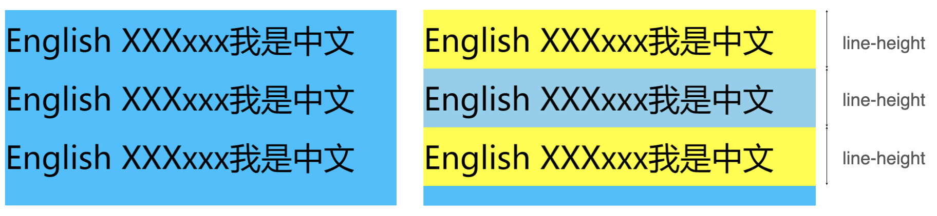
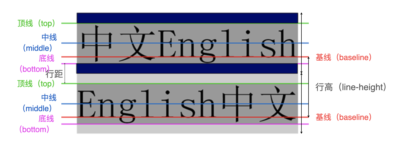
- 行高的严格定义是:两行文字基线(baseline)之间的间距
- 基线(baseline):与小写字母x最底部对齐的线
注意区分height和line-height的区别
- height:元素的整体高度
- line-height:元素中每一行文字所占据的高度
假设不设置元素的高度,则设置行高等同于设置元素的整体的高度
- 如上图基线到下一条基线的距离,经过公式计算,等同于一行元素整体的高度
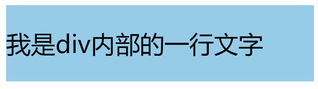
应用实例:假设div中只有一行文字,如何让这行文字在div内部垂直居中
- 让line-height等同于height
原理:假设文字大小为16px,行高为26px,则如上图,顶线到底线的灰色部分就为16px,26-16=10px,则浏览器会将这10px平分成上下行距,就是蓝色部分。所以行高与高度相同时,文字就会垂直居中。
line boxes
vertical-align会影响 行内块级元素 在一个行盒中垂直方向的位置
line boxes:行盒指的是CSS中一行文字所占据的可视化矩形空间,它通常由该行内所有文本、内边距、行高、行框线以及其他特殊对齐方式共同决定。
思考
- 一个div没有设置高度的时候,会不会有高度?
- 没有内容,没有高度
- 有内容,内容撑起来高度
- 但是内容撑起来高度的本质是什么呢?
- 内容有行高(line-height),撑起来了div的高度
- 行高为什么可以撑起div的高度?
- 这是因为line boxes的存在,并且line-boxes有一个特性,包裹每行的inline level
- 而其中的文字是有行高的,必须将整个行高包裹进去,才算包裹这个line-level
- 如果这个div中有图片,文字,inline-block,甚至他们设置了margin这些属性呢?
vertical-align – 不同情况分析
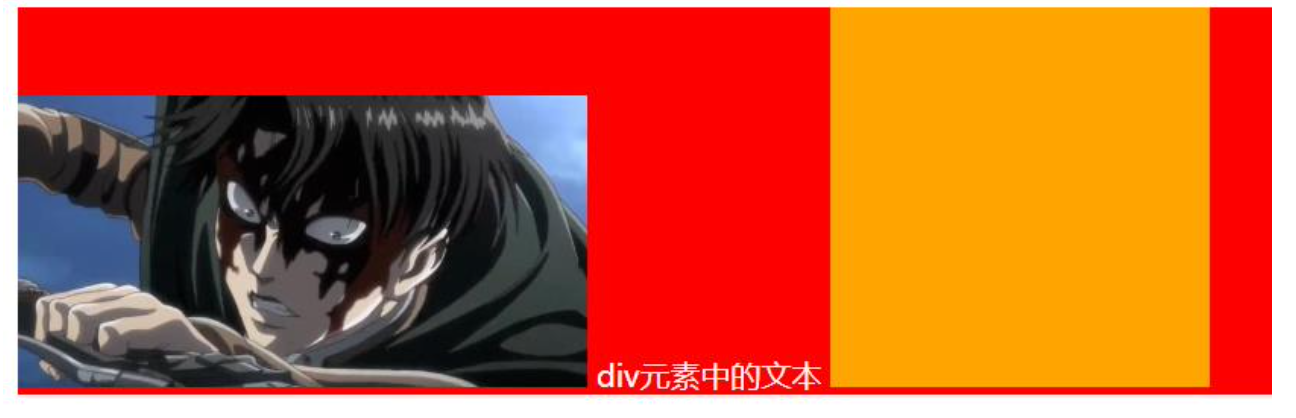
- 情况一:只有文字时,line boxes如何包裹内容?(注意:红色是包裹的div,下面也都一样)

- 情况二:有图片,有文字时,line-boxes如何包裹内容?
- 行盒默认是根据vertical-align对齐的,vertical-align默认是baseline对齐。所以图片的最底部对其文字的基线,也就是x的最底部。所以这也会造成图片底部有一些小空间
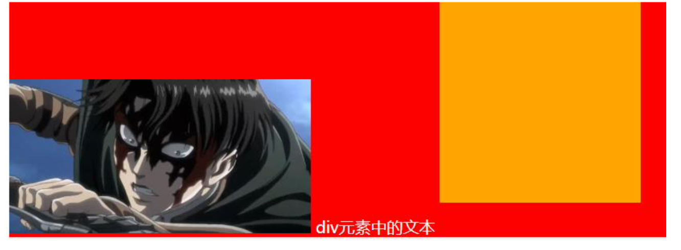
- 情况三:有图片,有文字,有inline-block(比图片要大)如何包裹内容?
- 由于行盒要包裹所有的行内级元素,所以这里整体会变大。
- 情况四:有图片,有文字,有inline-block(比图片要大)而且设置了margin-bottom,如何包裹内容?
- 行盒会包含行内级元素的margin值,所以这里会看到黄色盒了会上移。
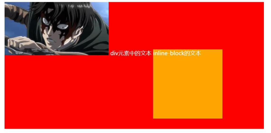
- 情况五:有图片、文字、inline-block(比图片要大)而且设置了margin-bottom并且有文字,如何包裹内容?
- 由于黄色盒了有了文字,则行盒默认是baseline对齐,所以这里黄色盒子会下移,让内部文字与其他行内元素对齐。
vertical-align的baseline
- 结论:line-boxes一定会想办法包裹住当前行中所有的内容。
- 但是,但是为什么对齐方式千奇百怪呢?
- 你认为的千奇百怪,其实有它的内在规律 答案就是baseline对齐
- 但是baseline都是谁呢?
- 文本的baseline是字母x的下方
- Inline-block默认的baseline是margin-bottom的底部(没有,就是盒子的底部)
- Inline-block有文本时,baseline是最后一行文本的x的下方
vertical-align的其他值
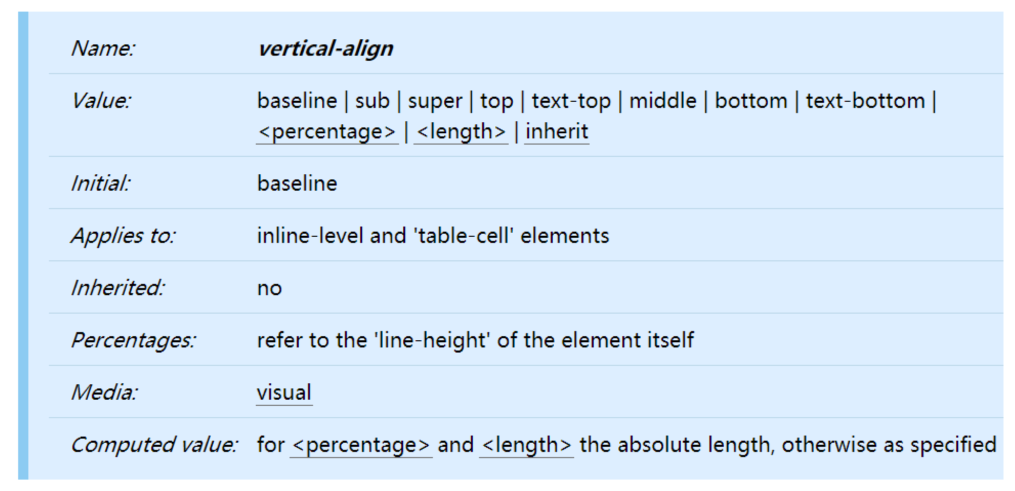
- baseline(默认值):基线对齐(你得先明白什么是基线)
- top:把行内级盒子的顶部跟line boxes顶部对齐
- middle:行内级盒子的中心点与父盒基线加上x-height一半的线对齐
- bottom:把行内级盒子的底部跟line box底部对齐
<percentage>:把行内级盒子提升或者下降一段距离(距离相对于line-height计算\元素高度), 0%意味着同baseline一 样<length>:把行内级盒子提升或者下降一段距离,0cm意味着同baseline一样
解决图片下边缘的间隙方法
行盒默认是根据vertical-align对齐的,vertical-align默认是baseline对齐。所以图片的最底部对其文字的基线,也就是x的最底部。x文字下面会有一些空间,所以这也会造成图片底部有一些小空间
- 方法一: 设置成top/middle/bottom
- 方法二: 将图片设置为block元素
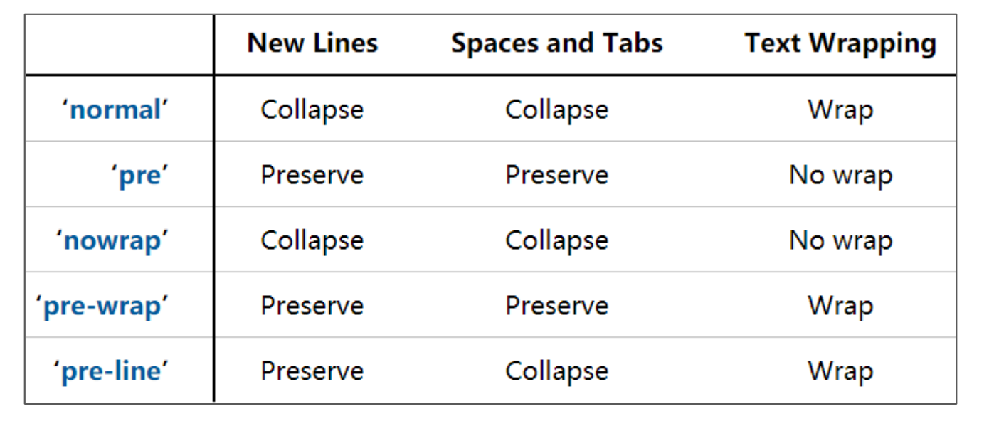
CSS属性 - white-space
在html元素中写内容时,会自动合并多个空白为一个空白。如果想改变可以通过这个属性更改。
- white-space用于设置空白处理和换行规则
- normal:合并所有连续的空白,允许单词超屏时自动换行
- nowrap:合并所有连续的空白,不允许单词超屏时自动换行
- pre:阻止合并所有连续的空白,不允许单词超屏时自动换行
- pre-wrap:阻止合并所有连续的空白,允许单词超屏时自动换行
- pre-line:合并所有连续的空白(但保留换行),允许单词超屏时自动换行
浏览器前缀
有时候可能会看到有些CSS属性名前面带有:-o-、-xv-、-ms-、mso-、-moz-、-webkit-
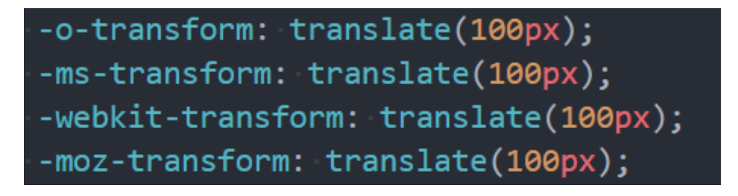
官方文档专业术语叫做:vendor-specific extensions(供应商特定扩展)
为什么需要浏览器前缀了?
- CSS属性刚开始并没有成为标准,浏览器为了防止后续会修改名字给新的属性添加了浏览器前缀;
- 上述前缀叫做浏览器私有前缀,只有对应的浏览器才能解析使用
- -o-、-xv-:Opera等
- -ms-、mso-:IE等
- -moz-:Firefox等
- -webkit-:Safari、Chrome等
- 注意:不需要手动添加,后面学习了模块化打包工具会自动添加浏览器前缀
BFC – Block Formatting Context
FC的全称是Formatting Context,元素在标准流里面都是属于一个FC的;
格式化上下文,也就是规定了元素在这个上下文中如何排列的,有什么特性。BFC也就是块级格式化上下文。
W3C官方文档的介绍
Boxes in the normal flow belong to a formatting context, which in CSS 2.2 may be table, block or inline. In future levels of CSS, other types of formatting context will be introduced. Block-level boxes participate in a block formatting context. Inline-level boxes participate in an inline formatting context. Table formatting contexts are described in the chapter on tables.
- 块级元素的布局属于Block Formatting Context(BFC)
- 也就是block level box都是在BFC中布局的;
- 行内级元素的布局属于Inline Formatting Context(IFC)
- 而inline level box都是在IFC中布局的;
Block Formatting Context
block level box都是在BFC中布局的,那么这个BFC在哪里呢?拿出来给我看看。
W3C官方文档的介绍
Floats, absolutely positioned elements, block containers (such as inline-blocks, table-cells, and table-captions) that are not block boxes, and block boxes with 'overflow' other than 'visible' (except when that value has been propagated to the viewport) establish new block formatting contexts for their contents.
MDN上有整理出在哪些具体的情况下会创建BFC:
根元素(
<html>)浮动元素(元素的 float 不是 none)
绝对定位元素(元素的 position 为 absolute 或 fixed)
行内块元素(元素的 display 为 inline-block)
表格单元格(元素的 display 为 table-cell,HTML表格单元格默认为该值),表格标题(元素的 display 为 table-caption,HTML表格标题默认为该值)
匿名表格单元格元素(元素的 display 为 table、table-row、 table-row-group、table-header-group、table-footer-group(分别是HTML table、row、tbody、thead、tfoot 的默认属性)或 inline-table)
overflow 计算值(Computed)不为 visible 的块元素
弹性元素(display 为 flex 或 inline-flex 元素的直接子元素)
网格元素(display 为 grid 或 inline-grid 元素的直接子元素)
display 值为 flow-root 的元素
注意:html是BFC,而body元素,所以默认htmlbody下所有的子元素都属于html的BFC。
BFC有什么作用呢?
In a block formatting context, boxes are laid out one after the other, vertically, beginning at the top of a containing block. The vertical distance between two sibling boxes is determined by the 'margin' properties. Vertical margins between adjacent block-level boxes in a block formatting context collapse.
In a block formatting context, each box's left outer edge touches the left edge of the containing block (for right-to-left formatting, right edges touch). This is true even in the presence of floats (although a box's line boxes may shrink due to the floats), unless the box establishes a new block formatting context (in which case the box itself may become narrower due to the floats).
简单概况如下:
在BFC中,box会在垂直方向上一个挨着一个的排布;
垂直方向的间距由margin属性决定;
在同一个BFC中,相邻两个box之间的margin会折叠(collapse);
在BFC中,每个元素的左边缘是紧挨着包含块的左边缘的;
那么这个东西有什么用呢?
解决margin的折叠问题;
解决浮动高度塌陷问题;
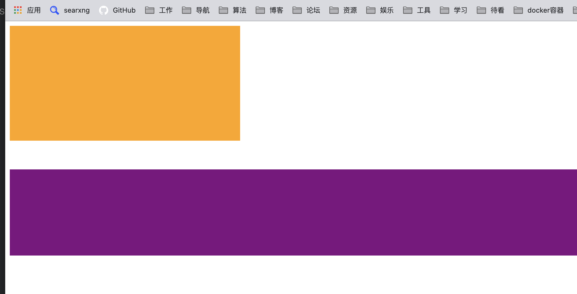
BFC的作用一:解决折叠问题(权威)
在同一个BFC中,相邻两个box之间的margin会折叠(collapse)
官方文档明确的有说
The vertical distance between two sibling boxes is determined by the 'margin' properties. Vertical margins between adjacent block-level boxes in a block formatting context collapse.
那么如果我们让两个box是不同的BFC呢?那么就可以解决折叠问题。
- 属于同一个BFC,会上下margin会折叠
<html lang="en">
    <style>
    .box1 {
      height: 200px;
      width: 400px;
      background-color: orange;
      margin-bottom: 30px;
    }

    .box2 {
      height: 150px;
      background-color: purple;
      margin-top: 50px;
    }

  </style>
  <body>
    <div class="box1"></div>
    <div class="box2"></div>
  <body>
</html>
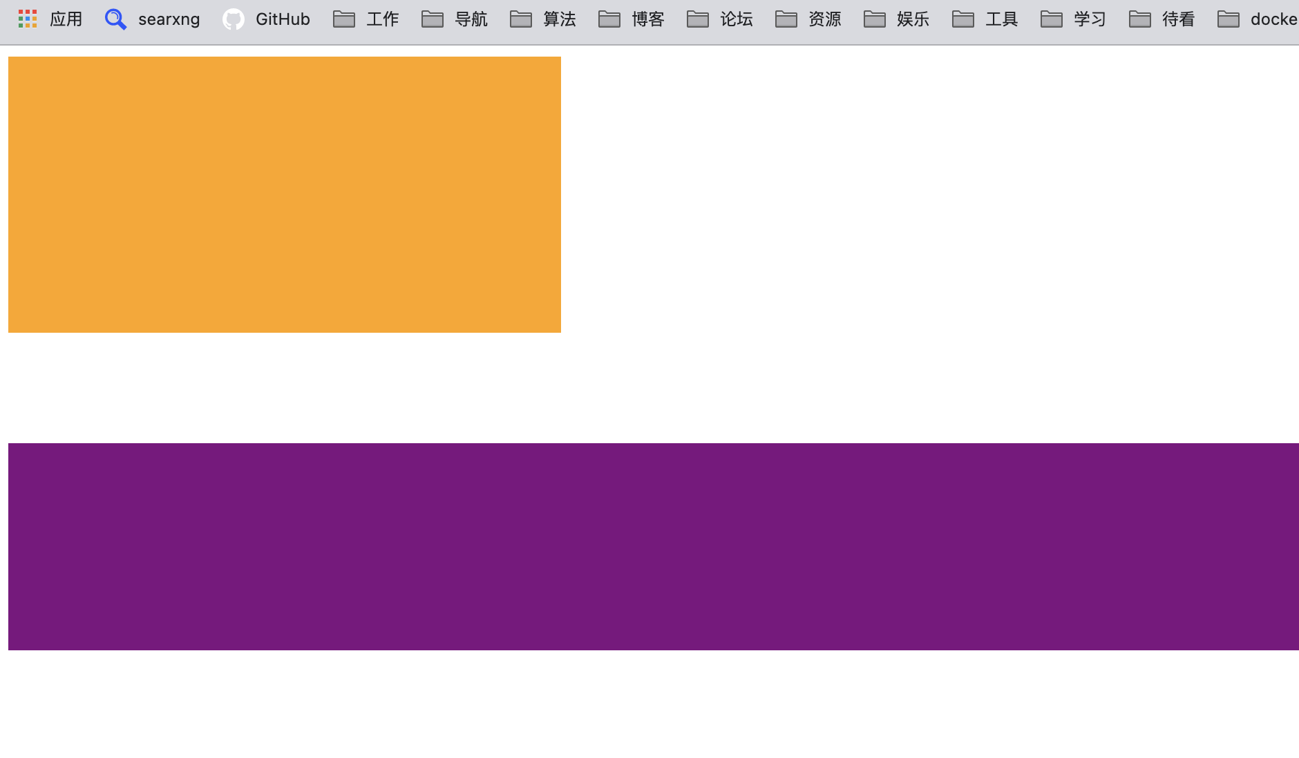
- box1属于container的BFC,box2属于html的BFC,两者不在同一个BFC下,所以上下margin不会折叠
<html lang="en">
    <style>
    .container {
      overflow: auto;
    }
    .box1 {
      height: 200px;
      width: 400px;
      background-color: orange;
      margin-bottom: 30px;
    }

    .box2 {
      height: 150px;
      background-color: purple;
      margin-top: 50px;
    }

  </style>
  <body>
   <div class="container">
    <div class="box1"></div>
  </div>
  <div class="box2"></div>
  <body>
</html>
BFC的作用二:解决浮动高度塌陷(权威)
- 网上有很多说法,BFC可以解决浮动高度塌陷,可以实现清除浮动的效果。
- 但是从来没有给出过BFC可以解决高度塌陷的原理或者权威的文档说明;
- 他们也压根没有办法解释,为什么可以解决浮动高度的塌陷问题,但是不能解决绝对定位元素的高度塌陷问题呢?
W3C官方文档:
10.6.7 'Auto' heights for block formatting context roots
In certain cases (see, e.g., sections 10.6.4 and 10.6.6 above), the height of an element that establishes a block formatting context is computed as follows:
If it only has inline-level children, the height is the distance between the top of the topmost line box and the bottom of the bottommost line box.
If it has block-level children, the height is the distance between the top margin-edge of the topmost block-level child box and the bottom margin-edge of the bottommost block-level child box.
Absolutely positioned children are ignored, and relatively positioned boxes are considered without their offset. Note that the child box may be an anonymous block box.
In addition, if the element has any floating descendants whose bottom margin edge is below the element's bottom content edge, then the height is increased to include those edges. Only floats that participate in this block formatting context are taken into account, e.g., floats inside absolutely positioned descendants or other floats are not.
事实上,BFC解决高度塌陷需要满足两个条件:
浮动元素的父元素触发BFC,形成独立的块级格式化上下文(Block Formatting Context);
浮动元素的父元素的高度是auto的;
BFC的高度是auto的情况下,是如下方法计算高度的
1.如果只有inline-level,是行高的顶部和底部的距离;
2.如果有block-level,是由最底层的块上边缘和最底层 块盒子的下边缘之间的距离
3.如果有绝对定位元素,将被忽略;
4.如果有浮动元素,那么会增加高度以包括这些浮动元 素的下边缘